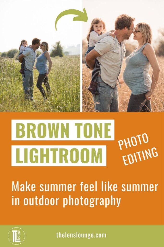

I enjoy green grass as much as the next person, but there’s something warming and emotional about an earthy brown photo edit in Lightroom. Sun bleached grass just shouts summer and travel so much more than healthy green grass.
Plus, the earthy brown tones really complement all skin tones in portrait photography. It’s probably why it’s such a popular edit for social media and why so many photographers want to know how to get brown tones in Lightroom. Or buy Lightroom presets with earthy tones.
Each photo is different, so how you get brown tones in Lightroom will vary slightly from one photo to the next depending on colors in the image and lighting. Regardless, you can get the look with just four Lightroom tools:
- White balance
- HSL
- Tone curve
- Color grading
The process is the same for all brown tones, only the amount of your slider adjustments changes.
Before you start to edit for brown tones, you need to make your basic adjustments to the photo so that it’s a good base image for color grading.
Also, when adjusting the colors of an image it’s important to remember to step away from the computer for a moment so that your eyes can reset and then come back to it. The danger is that as your eyes adjust to the color changes you’ll take your edit too far until it ends up looking comical.
That said, develop your own editing style and edit the photo the way you like it, including the brightness of an image. One person’s overexposed or over saturated is another’s perfect.
At the end I show you how to adjust brown tones for different photos once you’ve applied a preset or synched settings across other images.

Before you begin editing for brown tones…
Although it helps, you don’t need a professional DSLR or mirrorless camera. All digital cameras have the ability to choose between RAW format or JPEG format. To get the best possible results when color grading in Lightroom, you need to work on RAW images.
Far more detail is recorded with a RAW file format and you need this detail to get the best result from your edit.
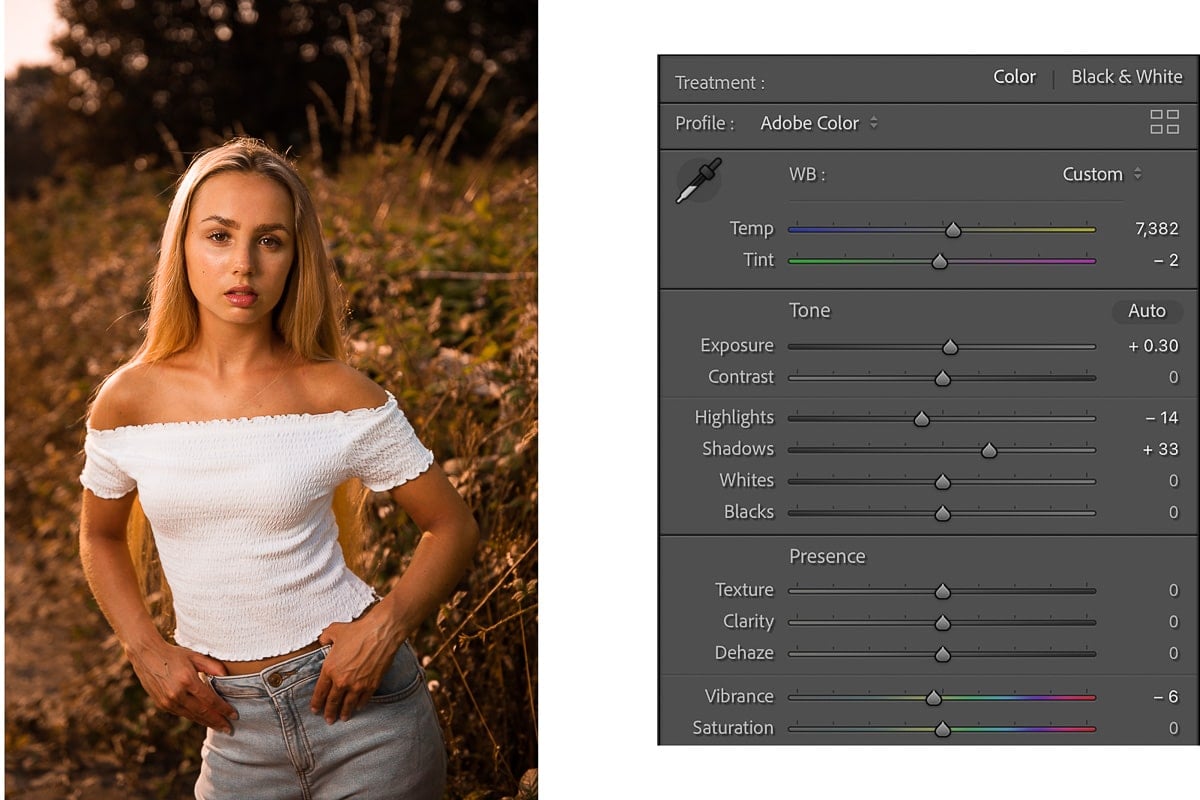
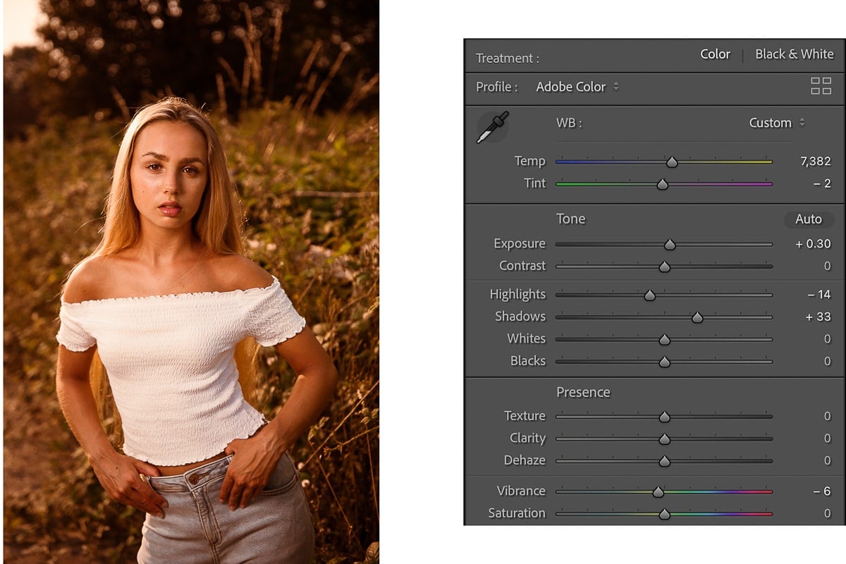
Step 1: white balance for brown tones
In the Lightroom Classic develop module, once you’ve made your basic exposure adjustments, go back to the white balance slider.
Unless your image is already a very warm image, you’ll want to take the white balance slider to the right to create/emphasize warm tones. This will help to bring out the brown tones in the photo.

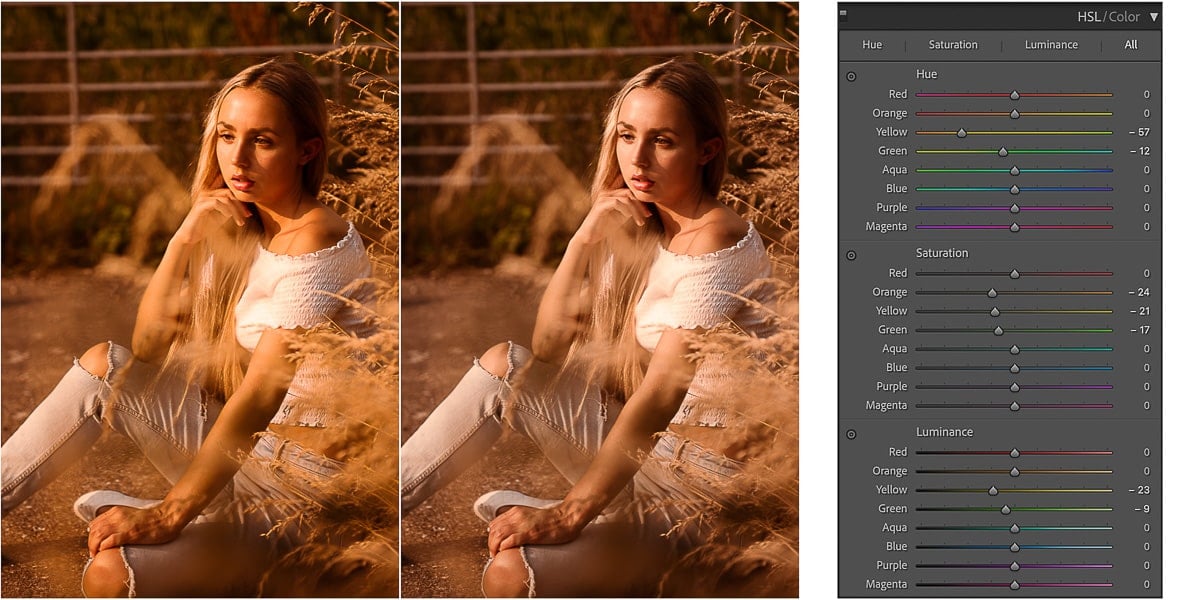
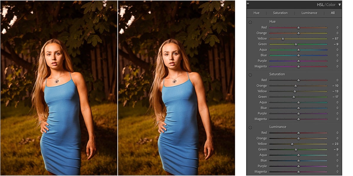
Step 2: Hue Saturation Luminance tool for brown tones
The next step is to adjust specific colors on a pixel level with the HSL tool. It’s a much more targeted approach to color grading than the tone curve as you can adjust specific colors rather than a range of colors with the tone curve.
As Hue Saturation Luminance is a three part tool, we’ll adjust each in turn.
Hue section of the HSL panel
The hue slider is the main factor in changing greens to browns in photos – cool tones to warm tones. For brown tones adjust these sliders to the left:
- Red slider
- Orange slider
- Yellow slider
- Green slider
Did you notice that if you take the:
- Red slider to the right, the reds become more orange
- Orange slider to the right, the oranges become more yellow
- Yellow slider to the right, the yellows become more green
And vice versa. Plus if you take the red slider to the left reds become more pink, which is the last slider in the list. Very tidy!
So now you know how you’re affecting a hue to just by looking at the slider above or below the one you’re working on.

How to use the targeted adjustment tool to save time
Instead of using the sliders to adjust each hue individually, you can also click on the targeted adjustment tool and then position your cursor on the hue you want to change. Click and drag upwards to make red more orange. Or click and drag downwards to make red more pink.
So clicking and dragging:
- Up drags all the relevant sliders to the right
- Down drags all the relevant sliders to the left
This applies to all sliders in the HSL panel and is my preferred way of working on hue, saturation and luminance. It’s also available in the tone curve panel.
Saturation section of the HSL panel
Now you’re going to want to saturate some colors and desaturate others, depending on the image. For muted warm brown tones adjust the same color saturation sliders to the left, namely:
- Red slider
- Orange slider
- Yellow slider
- Green slider
For this particular image I desaturated only the yellow and green colors.
Again, you can use the targeted adjustment tool to alter several saturation sliders at once.
Luminance section of the HSL panel
If you particularly like the moody look with brown tones, the Luminance sliders of the HSL Panel are your friend as you’ll use them to adjust the darkness of colors. For earthy brown tones adjust these sliders to the left:
- Red slider
- Orange slider
- Yellow slider
- Green slider
I reduced the luminance of only the yellows and greens in my example image.
And of course the targeted adjustment tool works with the luminance sliders as well.
How much you adjust them depends on your editing style, the colors in the photo and the lighting. For dark brown tones, take your sliders even more to the left to darken the colors further.
To undo any of your HSL adjustments, double click on the relevant text: “Hue”, “Saturation” or “Luminance”. Or click on the text of the individual color slider to change only that slider.
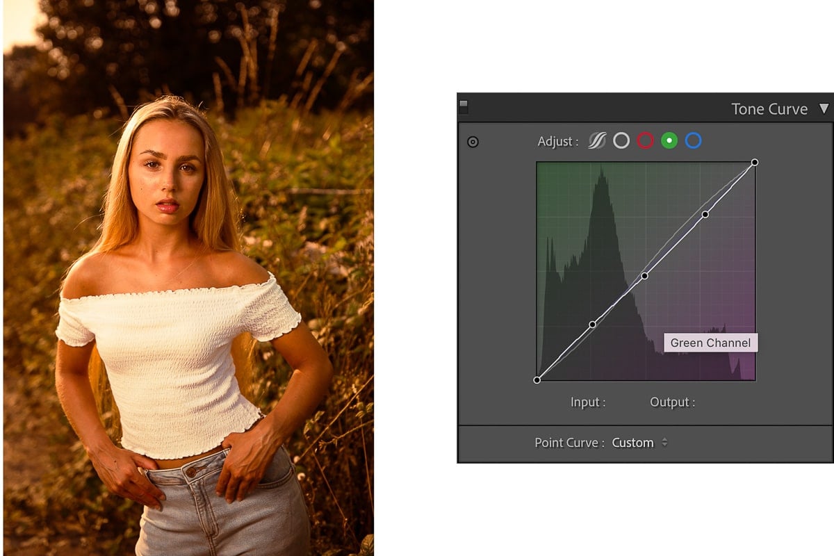
Step 3: Lightroom Tone Curve panel for brown tones
Although I prefer to work my way down the Lightroom Develop module from top to bottom, when it comes to color grading, I often prefer to go to the HSL panel first and then back to the Tone Curve panel. We’ll use both parts of the tone curve:
- Tonal contrast tone curve
- RGB tone curve
Tonal contrast tone curve
The first thing we’ll do is adjust the moodiness of the image by creating an s-curve on the tone curve, so:
- Click on the white circle to open up the tone curve
- Click on the curve at regular intervals to create 3 curve points
- Drag the highlights curve point up a little bit to brighten highlights
- Drag the shadows curve point down a little bit to darken shadows and increase contrast
For a film look take the bottom left of the curve and drag it up a little bit, according to taste. This will fade the blacks and create the film look.
RGB tone curve
Use the RGB tone curve to adjust the RGB values of the red, green and blue color channels across the entire image. Click on the curve of each color channel to alter the colors.
When you open each color channel, by clicking on one of the circles at the top of the tone curve panel, you’ll notice that the graph is split diagonally by the curve, with complementary colors either side.
- Red channel – pull down to change reds to cyan and push up to change cyan to red
- Green channel – pull down to change green to magenta and push up to change magenta to green
- Blue channel – pull down to change blues to yellow and push up to change yellow to blue
Where you click and drag on the curve will adjust the color balance of that area, specifically:
- Shadows
- Darks
- Midtones
- Lights
- Highlights
If your image has a lot of cool colors, to get the warm look associated with brown earthy tones, drag the middle of the curve on the blue channel down towards the bottom right corner. This adds an overall yellow color to the image. Small changes make a big difference in the tone curve, so it’s a small adjustment.
My example image was a warm image to start with, so benefitted more by adjusting the Green channel of the RGB curve downwards to make it more magenta and less green.
Getting the right look is about trial and error to start with, so you might try something, find it doesn’t work and then go back and do something different. This is why it’s such a time saver to create a preset to reuse in the future once you get the right look.
To quickly reset the tone curve double click on the point curve. Double clicking on the word “Adjust” will reset all changes you made to the RGB tone curve and contrast tone curve.

Step 4: Color Grading panel for brown tones
In previous versions of Lightroom the color grading tool was called split toning. It works the same way, but is easier to use and far more versatile now.
You’ll notice 3 color wheels when you open the color grading panel and click on the three circles at the top. They’re for:
- Midtones – add color to the midtones
- Shadows – add color to the shadows
- Highlights – add color to the highlights
How to use the color wheels on the color grading panel:
- The colored dot on the outside of the color wheel shows the color selected and can be moved around the color wheel to select the color you want to add
- Change the saturation of the color you add by clicking and dragging on the gray circle and moving it from the edge of the color wheel to the center to desaturate and vice versa
- Adjust the luminance of the selected color with the slider below the color wheel
Below all three color wheels are two more sliders:
- Blending – left to minimize the midtones and harden the transition between colors in shadows and highlights and right to soften it
- Balance – left to increase the shadow color/decrease highlight color and right to increase highlight color/decrease shadow color
Then there’s one more on the right on its own, the Global color wheel, which adds color to the entire image – shadows, midtones and highlights.
To undo any adjustment:
- Click on the relevant circle at the top of the panel (shadows, midtones, highlights or global)
- Then double click on the name text of the circle
Step 5: Adjust vibrance for brown tones
I prefer to leave my Vibrance adjustment until the end, after I’ve made all my color adjustments. If at that point the image feels too vibrant and I want a more subdued look, I decrease the Vibrance slider in the Basic Panel.

Step 6: Make a brown tones preset
Technically this has nothing to do with how to get brown tones in Lightroom Classic, but if you like the look you’ve created, now is a good time to create a brown tones preset for future edits. Building up a collection of your own presets that you can apply to images with simple clicks will help you to develop a recognizable style that you can easily repeat.
Creating presets takes your editing to the next level and will save you a lot of time in the future – you’ll be able to get brown tones in Lightroom with the click of a button.
To create a Lightroom preset:
- Click on the + next to Preset in the left panel of the Develop module
- Then click “Create Preset” and check relevant boxes, as above

Here’s a great article if you want to learn more about how to create Lightroom presets.
Or sync settings to other photos
If you don’t want a preset, but just want to copy the brown tones across other photos from the shoot, you can easily do this by:
- Select the image you’ve just adjusted
- Then hold down shift and click the last photo in the series you want to copy your brown tones to
- Click Sync to open up the Sync Settings men
- Check: Treatment & Profile, White Balance, Vibrance, Tone Curve, HSL/Color, Color Grading and Calibration
- Click Synchronize
As above.
What to do when a brown tone preset doesn’t look right
Now, just because you shot the images at the same time, in the same light and a similar setting, doesn’t mean that the settings are going to be exactly right for all the photos in the series.
Here are a few pointers why and what you can do about it. This is the same advice for altering a preset as well…
For the next three examples the:
- Original photo is on the left
- Middle photo is what it looked like when I copied the brown tones settings across
- Photo on the right is what the photo looked like after I tweaked the settings slightly
For reference, the photo above is a repeat of the original HSL Panel of my brown tones preset. You’ll notice that most of the time you only need to adjust the sliders by a small amount to get it looking just right.

Before and after adjusting my brown tones preset. For this photo I adjusted the:
- Adjusted the hue of both the yellow channel and the green channel to the left
- Took saturation down slightly of both yellow and green channels
I left the Luminance sliders untouched.

In the next photo the green vegetation in the background and yellow grass in the foreground both felt too saturated, making the warm look of the brown tones too warm.

In the HSL Panel I:
- Left the Hue sliders and the Luminance sliders untouched
- Desaturated the yellow and green channels a little bit more
When you have different colors in a photo from the one you used to create your Lightroom preset, you might need to make more of an adjustment in the HSL Panel for better looking brown tones.

So for this photo I needed to make slightly stronger adjustments to my brown tones preset in the HSL panel.
- I took the only the green slider in Hues and moved it slightly to the left to make the greens less yellow
- I left the yellow hue slider untouched
- I desaturated the orange slider by -10, the green slider ever so slightly by -1 and left the green slider untouched
I left the luminance sliders untouched
If you enjoyed this article on presets for warm tones, you might also like to learn how to create a preset for cool tones and why buying presets can be a waste of money if you don’t know how to adjust Lightroom presets.
Create a brush preset for brown tones
Now that you know how to create brown tones in photos, try creating a brown tone brush preset for local adjustments for the times that don’t want to apply a brown tone preset to the entire image.
Leave a comment
If you have any questions about how to get brown tones in Adobe Lightroom Classic, let us know in the comments.
Also, I love good news, so if my Lightroom editing tutorial has helped you with your photo editing, share that too.
Thank you, very helpful
Thank you it’s the best explanation I have ever found abd will save me hours of searching
Happy to help, Karen. Thanks for your comment.