


The Lightroom tone curve is one of the most powerful features of Lightroom Classic. You can do so much with the tone curve and it forms the basis of most Lightroom presets. Because of this I think it’s also a little intimidating at first.
If you don’t understand the tone curve, you probably just use the whites, blacks, highlights and shadows sliders in the basics panel. We all start out there.
It looks like they do the same thing and they’re much easier to operate than the tone curve at first glance. That’s absolutely fine when you’re new to Lightroom, but once you become more proficient in Lightroom editing, you’ll want to use the tone curve tool.
Used well, the Lightroom tone curve is like a magic wand that abracadabras your photos to the next level.

What is the Lightroom tone curve?
The tone curve is a tool in Lightroom used for adjusting tones to make images brighter or darker, and to adjust colors. Tones in photos, from shadows, to darks, midtones, lights and highlights are adjusted using the RGB curve. Colors are adjusted using the separate red, blue and green curves.
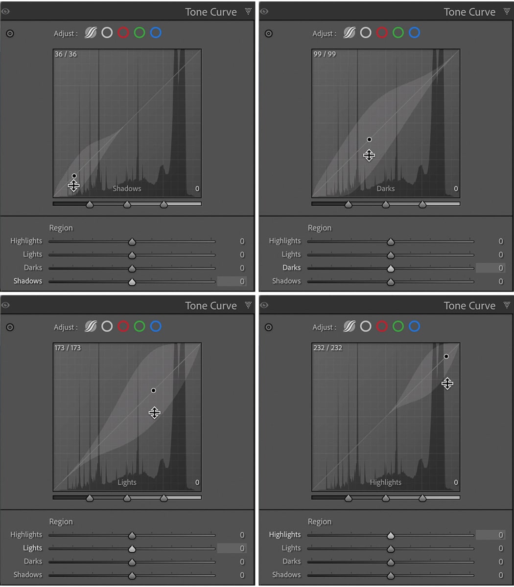
Both the RGB tone curve and the color tone curves are divided into 4 tonal areas, starting from the left:
- Shadows
- Darks
- Lights
- Highlights
A diagonal line between the bottom left corner and the top right corner is the line that you adjust to alter the tone curve.
Where is the tone curve in Lightroom?
The tone curve tool is a panel on the right of the Develop Module. Both the tone and color curves are in the same panel.
As of 2023 the Lightroom tone curve became even more powerful, because now you can use curves with masking in Lightroom Classic.
So you can apply the tone curve to very specific areas of an image instead of to the whole image, even with the Lightroom brush tool. It works exactly the same way as the settings in the Tone Curve panel.
More on this at the end.
Why use the tone curve tool vs sliders in the Basic panel?
Not counting the color curve channels, you might wonder why use the RGB tone curve in Lightroom to adjust light and dark areas of a photo when you can do the same thing with the whites, blacks highlights and shadows sliders in the Basic panel.
Well, that’s because the tone curve works differently from these sliders. They both work, but have different results.
With the shadows and highlights sliders, the adjustment is more targeted to that part of the image. So, if you adjust highlights, there’s minimal impact on the shadows and vice versa.
That said, when using curves you have more control over contrast.
You can anchor the midtones so that they’re not affected, then adjust highlights, lights, darks and shadows. Even taking the lights and darks to extreme you’ll maintain detail in the midtones.
So, with curves you can get a much punchier image with greater detail over the entire dynamic range than you would using the sliders in the Basics panel.

However, for a well processed image, use both the tone curve and the sliders in the basic panel to make adjustments as needed.
How do I create a custom tone curve in Lightroom?
Before you get into creating a custom Lightroom tone curve, you might want to experiment with the other (easier) ways first.
In total there are three ways to use the RGB tone curve to adjust tones in an image…
- Parametric tone curve – with sliders
- Point tone curve – with presets
- Point tone curve – custom
Actually, there’s another way too, but I’ll get to that in a moment when we discuss color grading with the tone curve.

1. Parametric tone curve regional sliders
If you’re new to using the tone curve tool in Lightroom, but want some control editing your Lightroom tone curve adjustments, start by using the regional sliders in the parametric tone curve panel.
It’s like having training wheels on. You can adjust the curve, but the adjustments you make will be more controlled.
To open it click on the first circle (with the waves) above the tone curve.
2. Point tone curve presets
If you don’t want to set the point tone curve yourself, you can select one of two tone curve presets:
- Medium contrast
- Strong contrast
Just click on the white circle above the tone curve to open the point curve option, then the up/down arrows next to “Point curve”. A drop down menu will open and then select the tone curve preset you want to use.
Select “Linear” from this menu to reset the point curve (or double click on the word “Adjust” next to the circles above).
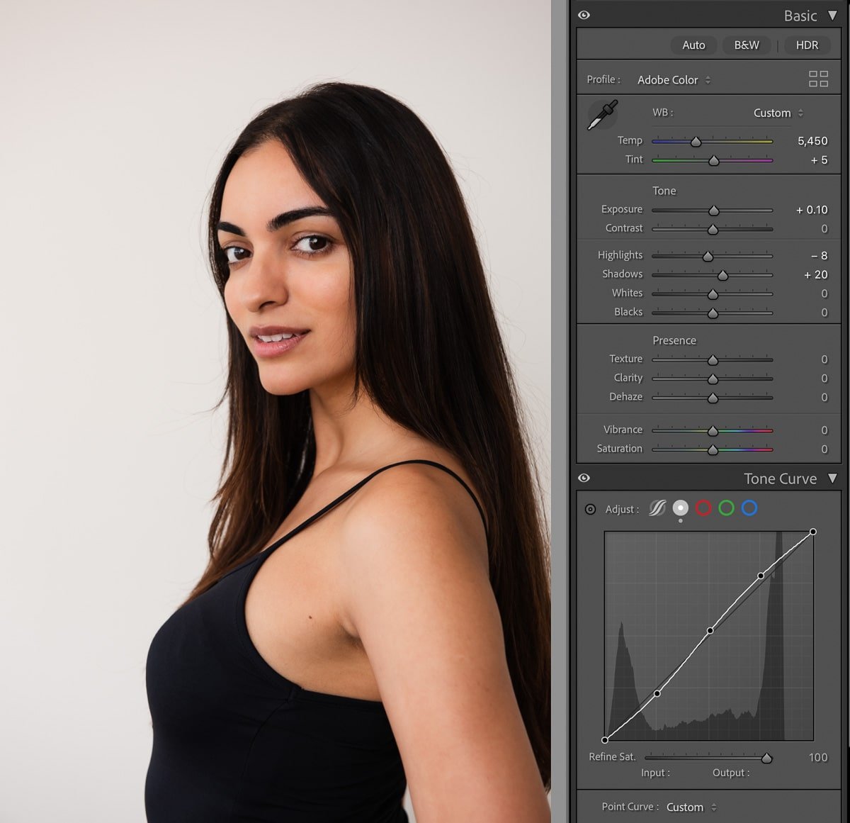
3. Custom tone curve
For full control of adjusting contrast in an image with the tone curve in Lightroom, you need to open the point curve.
- Click on the white circle above the tone curve
- Then add curve points to the curve, then adjust by clicking and dragging on the points

What should a Lightroom tone curve look like?
There are no hard and fast photo editing rules on what a tone curve should look like, but the most common curve to use for adding contrast in photos is the S curve.
For tonal contrast and punch in a photo, here’s how to set the S curve:
- Create 3 points on the curve at the quarter, half and three quarter marks
- Pull the shadows point down
- Raise the midtones point slightly, or simply anchor them by not moving the point at all
- Raise the highlights point
For a flat image, with reduced contrast, you’d simply do a reverse S shape. In other words, raise the shadows and pull down the highlights.

But remember, S curves aren’t the only way to use the tone curve in Lightroom. You could also adjust just one area. For example to adjust midtones:
- raise the midtones by dragging the middle of the curve up
- or darken them by dragging the curve point down
The trick is not to go mad and make your curve look like the screen of a hillclimb workout on an exercise bike.
What is color grading in Lightroom?
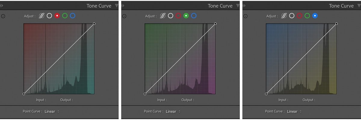
The final aspect of setting a custom tone curve in Lightroom is the color curves. These are the red, blue and green circles above the tone curve.
As opposed to color correction, which is to correct colors in photos (no kidding!) to appear more accurate in an image, color grading is a creative photo editing process that infuses emotion into an image by manipulating color.
You can learn more about using color in photography to influence emotion and atmosphere in my detailed tutorial.

How do you create a cinematic look in Lightroom?
There’s a lot of talk these days about creating a cinematic look in Lightroom photo editing and this is essentially about color grading a photo for a film look.
The tone curve tool is an essential part of creating the cinematic look in Lightroom using both the RGB tone curve and the color tone curves.
Because black and whites in film aren’t as stark as in digital photography, the starting point for a cinematic look is to fade the blacks and the whites. Do this by:
- Slightly raising the far left curve point on the RGB tone curve to fade the shadows
- Then slightly lower the far right curve point to flatten the highlights
The use of complementary colors features heavily in color grading in Lightroom as do contrast, hue, saturation and luminance adjustments.
An easy way to introduce complementary colors to photos in post production is to use the color channels. Each channel can be adjusted for its complementary color. So:
- Red channel – can be adjusted up for more Red or down for Cyan
- Green channel – can be adjusted up for more Green or down for Magenta
- Blue channel – can be adjusted up for more blue or down for Yellow
In practice, as with the cross processed image below, you’d adjust the darks and highlights, then switch to the color curves channels and:
- Raise the far left curve point to add blue into the shadows or drag it to the right to add yellow to the shadows
- Lower the far right curve point to add color to the highlights or drag it to the left to add blue to the shadows

Whatever you do, make sure that your adjustments are small so that your photo doesn’t look over processed. Especially with color curves – it takes a tiny adjustment to make a big difference to a photo.

Lightroom tone curve presets
An even easier way to cross process photos, or adjust the contrast, is to use one of the default Lightroom tone curve presets, listed under Presets in the left hand panel of the Develop Module.
Once applied, if you want to adjust the effect, you can then click and drag on the tone curve points to your liking.

Lightroom masking with the tone curve tool
For very precise editing of specific areas of your image, create a mask and then adjust the tone curve in the mask.
For the image below I created a background mask and then clicked and dragged in the middle of the tone curve to brighten the background.
You can’t use the parametric tone curve in masking, but all other options are available.

As you can see from the before and after images below, it was a subtle adjustment, but was highly effective at making the background whiter. And so quick!

Apply tone curve adjustments to multiple photos at once
If you’re thinking this will make editing a shoot take ages, the good news is that you don’t need to create a new tone curve for every photo you edit.
It’s really easy to apply your tone curve settings to multiple photos at once using Lightroom batch editing. This will really speed up your workflow, but before you do it, make sure that all the photos were taken in similar conditions.
Last words on the Lightroom tone curve
As soon as you understand how the tone curve works, you’ll see that it’s not difficult and it offers so many great opportunities for different edits. To develop your own photo editing style in Lightroom, you need to get to know the tone curve tool. You’ll love it!
Leave a comment
If you have any questions about editing photos with the Lightroom tone curve, let us know in the comments.
Also, I love good news, so if my tone curve tips have helped you to understand how to use the Lightroom tone curve tools, share that too.
Thanks for posting this additional information.
My pleasure, Cathy! Combined with what you’ve learnt in our Lightroom course, plus practice, you should now start to get a good handle on the tone curve. Looking forward to seeing more of your edits in the student Facebook group.
Thank you for this article. I just recently started using the Tone Curve myself. I start with the Basic panel and do all I can with those tools, including the Contrast slider sometimes. But if I can’t get the look I want I will also then use the Tone Curve. I have not tried the RGB button but now I want to.
You are right about getting the image over processed though – you can just get carried away with those tools!
Oh, you’re going to love using the RGB channels – so many possibilities!
Where do you start? The basic panel and then curves or in reverse?
I used to start with the basic panel and work down through the panels from top to bottom, but I’ve found that once I apply a tone curve I very often go back and adjust the highlights and shadows sliders in the basic panel. So now I start by applying a curve and then go to the basic panel.
Thank you for your article. While you didn’t go into great depth, you did lay everything out quite clearly and allowed me to finally grasp the concept of the Tone Curve and begin to see some of the nuances. I also liked the hyperlinks to other articles you have written. I will definitely look for more.
Concise, informative and easily absorbed. Well done Jane. Thanks for sharing your skills.
Cheers, Doug Stead
B.C. Canada 🇨🇦
Thanks for your comment, Doug – good to know it’s helpful and easy to read.