Like with many things, there’s a time and a place for color grading in photography. Photographing products for a client, is a great example of when not to get creative with your Lightroom color grading, unless the photos are editorial and not meant to be an accurate portrayal of product colors.
A creative portrait shoot is the perfect opportunity for creative color grading in Lightroom.
Before I get into the ins and outs of what is color grading, it’s important to note that RAW files are better than JPEG files for good color grading. JPEG files don’t have the necessary detail in the colors for effective color grading in Lightroom, or any other photo editing program.

What is color grading photography?
Color grading photos involves manipulating colors in post processing to create a stylized look for mood and atmosphere by adjusting color in the shadows, midtones and highlights.
While you can add color to all the tones when color grading photos, you don’t have to. Sometimes less is more.
Color grading is different from color correction, which is the process of correcting colors in photos to ensure that colors captured are true to life.
Not every photo needs to be color graded, but developing your color grading techniques for a unique look is a great way of establishing a personal style. It’s not the only way, of course. I’m just referring to the post production side of developing a personal style.
How you shoot, where you shoot, how you light your subject, even your favored focal lengths are all aspects of your style. Some of these things also affect your color grading, which is why just applying a preset to your photos won’t necessarily result in the look you want.
Lightroom color grading involves adjusting the following:
- White balance
- White point
- Black point
- Vibrance
- Color saturation
- Tone curve
- Hue saturation luminance
- Color grading (used to be the split toning panel)
- and sometimes calibration
You don’t have to use every single color grading tool available on every photo. That would be like adding every condiment in your cupboard to every meal.
What is cinematic color grading?
To understand cinematic color grading we need a look at the color wheel. Well, actually, with any type of advanced color grading, knowledge of the color wheel and color theory is essential. All color decisions in art, film and photography are made with the color wheel in mind.

The reason it’s referred to as cinematic color grading is because photographers have followed in the footsteps of the movie industry when processing photos and use the same techniques.
However, many have become stuck on just one type of color grading.
Get my color wheel sent straight to your inbox to help with planning your next shoot and color grading in post production…
What is the most common cinematic look for a color grade?
Most often when photographers talk about creating a cinematic color grade, they’re referring to using complementary colors in their color grading. Very often this means orange and teal, because this is what you see in many big blockbuster movies.
So much so that orange and teal is referred to as the summer blockbuster color grade.

Orange and teal are opposite each other on the color wheel, so they’re complementary colors and therefore dynamic.
In portrait photography orange and teal color grading works well, because it creates maximum contrast between orange in skin tones and highlights and teal in neutral colors in the background and shadows.
This color contrast helps the subject to stand out.
It’s particularly effective to bear in mind your planned color grading before shooting. This way you can plan for it in clothing and background.
But there’s much more to color grading and the cinematic look than just adding orange to the highlights and teal to the shadows in Lightroom, or whichever software you choose to use.
In fact, using complementary colors is just one way of color grading photos.
Color schemes for color grading photos
Using balanced color schemes creates unity in an image. For example, for a balanced color scheme, refer to the color wheel to find analogous colors, which are considered harmonious.
The four most common color schemes in photography composition are:
- Complementary colors
- Monochromatic colors
- Analogous colors
- Triadic colors

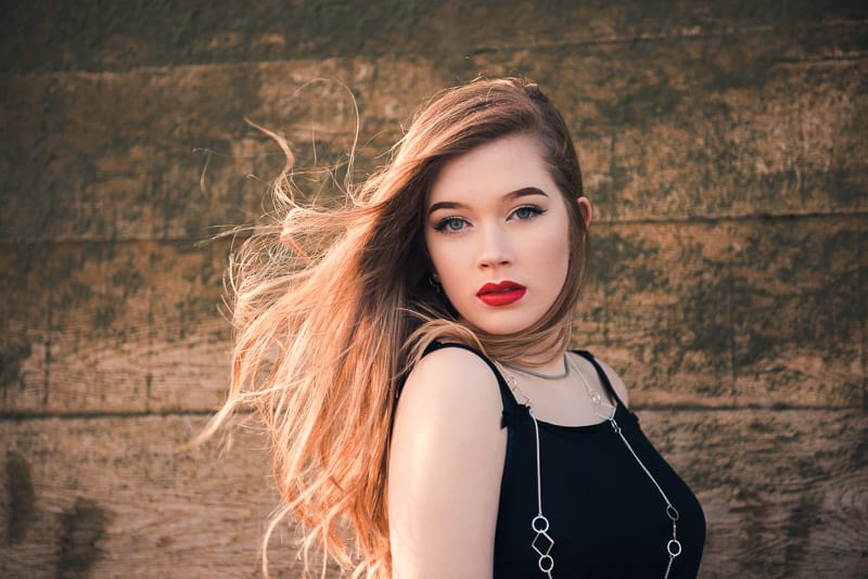
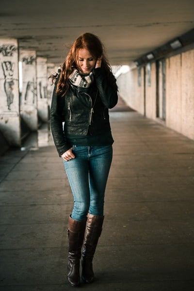
Each of these examples of color grading uses different combinations of complementary colors in the shadows and highlights. The first image I used orange and teal, the second yellow and purple and the last red and green.
1. Complementary colors
We’ve already touched on the popular orange and teal complementary colors of color grading. Although it’s the most popular combination, they’re not the only complementary colors on the color wheel.
For a complementary color scheme, use a color from the warm side of the color wheel with its opposite on the cool side of the color wheel.
Aside from orange and teal, other great complementary color combinations to use in portrait photography are:
- Yellow and purple
- Red and green
2. Monochromatic colors
A monochromatic color scheme doesn’t mean that your photo has to be black and white. To create a monochromatic image, use shades of just one color, such as orange, in:
- the scene,
- your subject
- and your color grading
This creates a harmonious feel to the image.
3. Analogous colors
When you use three colors that are next to each other on the color wheel, you’re using analogous colors. Again, they emphasize harmony in an image as there’s no tension created by using opposing colors.

I used analogous colors of green, greeny-yellow and yellow to color grade this image (the before image is on the left): Split toning – yellow in highlights, green in shadows. I dragged the blue channel of the RGB tone curve down slightly for more yellow in the mid tones. I also pushed the white balance slider more towards yellow.
It’s easy to find analogous colors in nature as a backdrop for your shoot, for example:
- Rolling green hills with green shrubs, grasses and trees
- Autumn woodland with shades of orange leaves
- The sea with shades of blue
Next, just plan outfits that work with the scene, then process in Lightroom using these colors in your color grading.
4. Triadic colors
You’ll see triadic colors used less in portrait photography as it’s quite a vibrant color scheme. Think superheroes. For this scheme select three colors that are evenly spaced around the color wheel, such as red, blue and yellow.
When using a triadic color scheme, one color should be dominant and the other two used as accents.

Is color grading necessary?
No, color grading isn’t necessary for every photo you create. However, it’s a lot of fun and, as I mentioned, a way to develop your style as a photographer. Intentionally using and editing color in photography takes your photography to a higher level.
Because color affects us emotionally and psychologically, if you want to sway your viewer’s mood and make the most of an image, color grading in Lightroom is an ideal way to bring your image together for maximum impact. For example a photo with saturated colors feels more energetic than an image with muted colors, which can feel melancholic.
If you’ve planned the location and your subject’s clothing colors, it makes sense to finish off with color grading in Lightroom, or similar photo editing software.
How to color grade in Lightroom
The three main tools for color grading photos in Lightroom are (in the order that they appear):
- Lightroom tone curve
- Hue Saturation Luminance sliders
- Color grading (used to be called split toning)
Of these, the RGB tone curve and the color grading panel are used heavily for creating a film photography look and for cinematic color grading such as the orange and teal blockbuster look.
The calibration panel sliders are also highly effective for color grading images, but aren’t as popular as the other three tools.
1. Using the tone curve for Lightroom color grading
First, use the tone curve to add contrast to a photo by:
- Setting the white point and black point
- Creating an S-shape tone curve

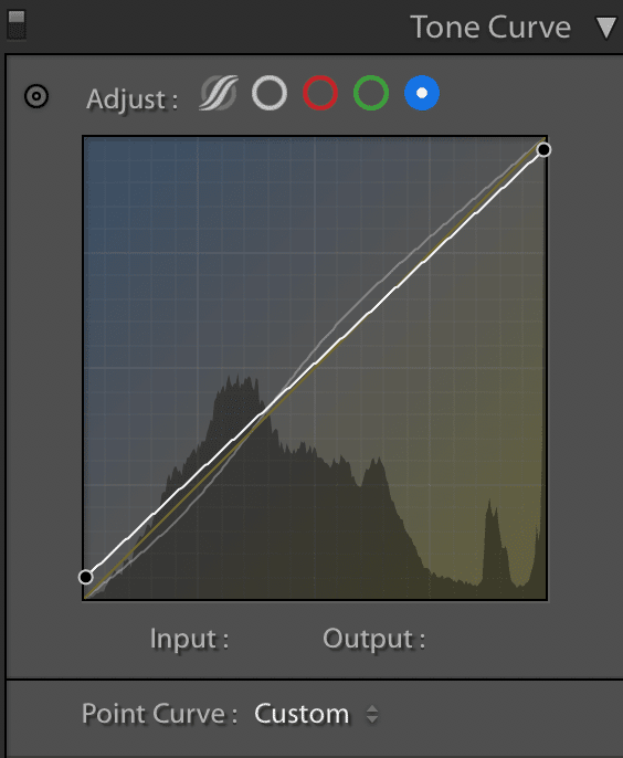
Adjust the RGB channels individually on the RGB tone curve to affect color in the dark, mids and light tones. Each channel affects just 2 colors. Use the:
- Blue channel – to increase and decrease blue and yellow
- Green channel – to increase and decrease green and magenta
- Red channel – to increase and decrease red and cyan
I use the blue channel more than the other two channels for color grading portraits and creating Lightroom profiles and presets.

When using the RGB tone curve, your adjustments will be very small. The slightest change can have a big impact on the colors in your photo.
2. Lightroom’s Hue Saturation Luminance sliders
There’s no end to the number of adjustments you can make using the HSL sliders. The HSL panel is designed to adjust the hue, saturation and luminance of individual colors, so you can really fine-tune the look of a photo with this tool.
There are no rules on how much you should or shouldn’t adjust the HSL sliders.

Above are screenshots from two different photos showing extensive use of the HSL sliders in one photo and minimal use in the other.
Sometimes I don’t touch these sliders at all. Everything depends on the look I want, so it varies from one photo to the next and from one color grading effect to the next.

3. Color grading panel in Lightroom
The color grading panel looks more complicated than it is. It consists of four color wheels that can be adjusted to add color to:
- Midtones – adding color to the midtones will affect skin tones
- Shadows
- Highlights
- Global – as the name suggests, this adds color to all tones in the entire image
The hue, saturation and luminance of each color wheel can be adjusted individually.
The color grading sliders are:
- Blending slider – adjusts the transition of the added color for a blended, smoother look or more sudden transition
- Balance slider – leave in the default setting for an even amount of color, or adjust left for more emphasis on the shadow color, or right for more emphasis on the highlight color.
4. Split toning panel for Lightroom color grading
The split toning panel was replaced in the October 2020 Lightroom update by the color grading panel, which is much more powerful and versatile.
If you use a previous version of Lightroom, you might still be interested, so I’ve left the split toning panel information in this tutorial…
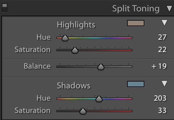
Split toning was a very popular choice for beginner color grading in Lightroom as it’s easier to use than the RGB tone curve. Here you adjust both the color and the saturation of:
- Highlights
- Shadows
You can also adjust the balance of the split toning if you want more emphasis on the highlights or the shadows by moving the balance slider.

Leave a comment
If you have any questions about cinematic color grading in Lightroom Classic, let us know in the comments.
Also, I love good news, so if my Lightroom color grading tips tips have helped you to understand how to achieve the cinematic look in Lightroom, share that too.


