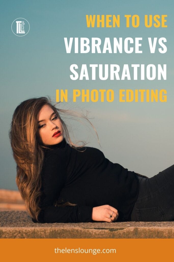
The more attention you pay to the color in your photos, the more aware you’ll become of how vibrance vs saturation impacts color when editing photos in Lightroom and other editing software.
Color is one of those subtleties that you need to learn to see and the only way to do this is with practice. Just like with light. As a new photographer you’re not aware of light direction for photos and quality, but with time you start to notice light and shade.
Over time, when processing and printing images, you’ll start to see the subtle differences in color and after a while, these color variations will be glaringly obvious. That’s when you’ll go back and re-edit old photos! It happens to all of us.
So, if you get to the point where you’re looking at old photos and you’re cringing, congratulations! You’ve advanced in your photography journey.
But back to color in photos…
Colors create an emotional response, so it stands to reason that how we use color in photos is really important for the mood of a photo.
We’re drawn to vibrant colors because of the intensity of the colors. Because of this, you’ll often see/hear photographers discussing how to “make colors pop” in photos. A big part of this is adjusting color saturation and vibrance.

As you can see, both vibrance and saturation can be used to increase or decrease color intensity, but they do it differently. It’s very easy to go too far when you don’t know when to use vibrance vs saturation, which you’ll see further down in this Lightroom tuturial.
So let’s take a look at using vibrance vs saturation for better editing of color in photos.
What does saturation mean?
Saturation refers to the intensity of colors in an image.
When an image is highly saturated colors are rich, bright and strong. When saturation is low, colors appear washed out and, as they become more desaturated, they veer towards grayscale.
This is as true for painting as it is for photography.

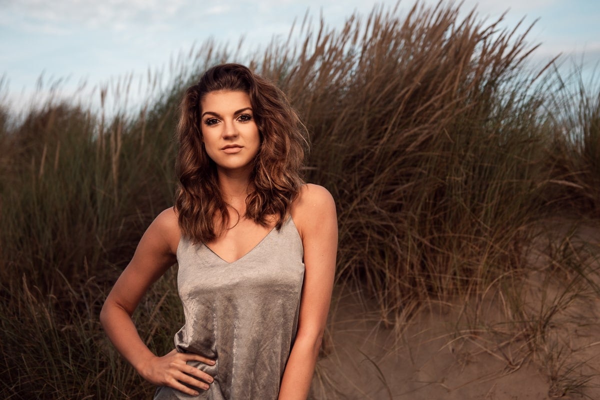
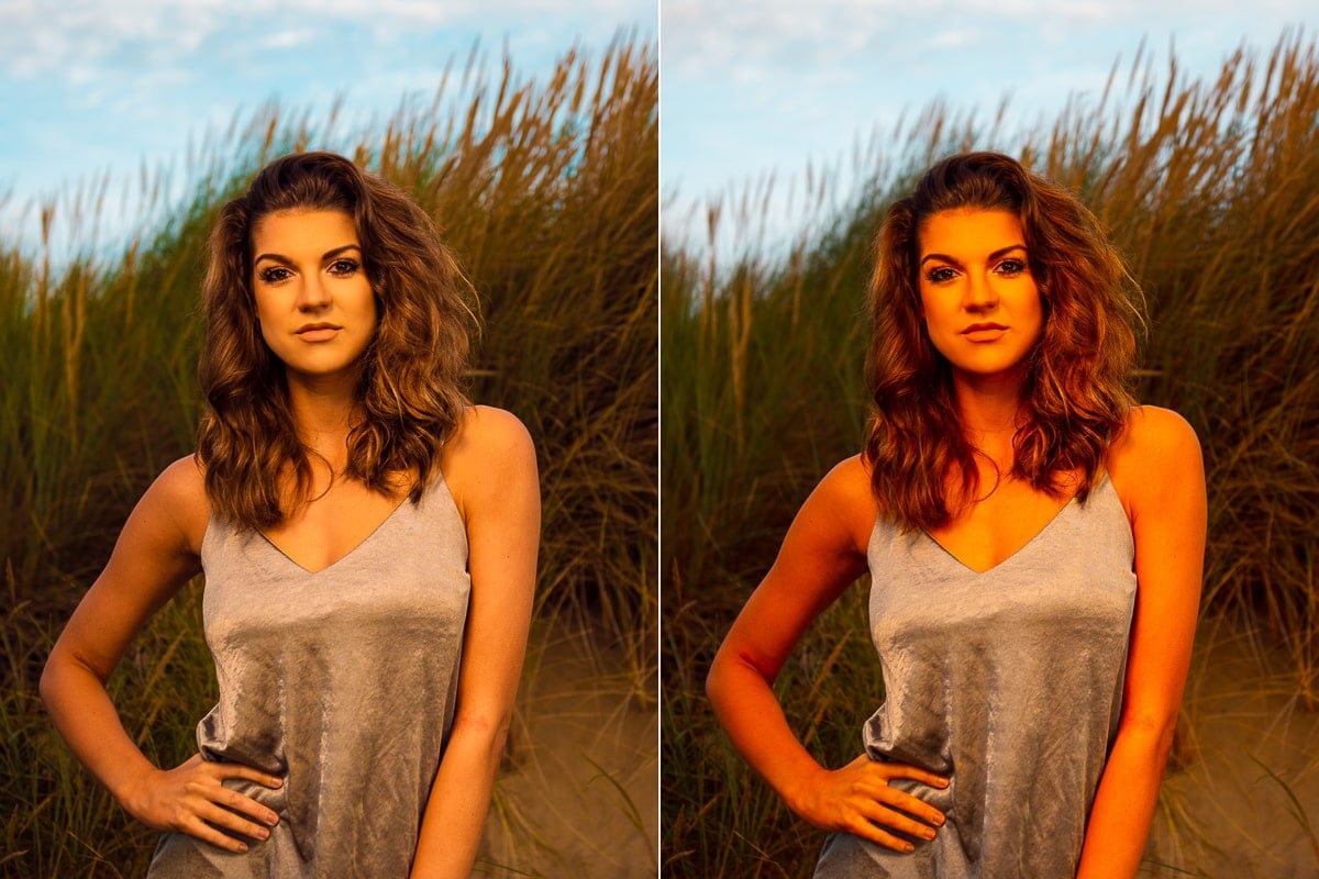
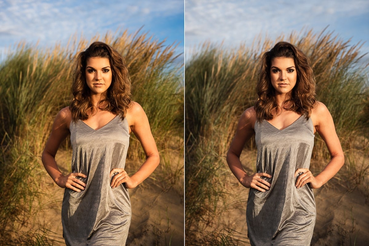
The image on the left has muted colors. She’s wearing pale yellow and is backlit, so the light blue sky isn’t saturated.
I took the photo on the right 1.5 hours later, just before sunset, so the sky is a saturated blue and the light on her is a golden yellow. Plus, her clothing is deep orange and yellow and she’s lit from the side, so it’s a much more saturated image.
How do you capture saturated colors in photographs?
Saturation in photography is a result of light. The angle, direction, quality and quantity of light affects the saturation of colors in photos.
You can easily test this out yourself with the torch on your phone and a colorful sheet of paper. Try this:
- Hold the torch close to the paper so that you can see a round circle of light.
- Colors at the center of the beam, where it’s brightest, are desaturated, or washed out.
- They become more saturated away from the center and are especially saturated beyond the edge of the light.
When you photograph with the sun behind your subject (backlit), colors will be less saturated than if the sun lights the subject from the side or front (in other words from behind you).
The color of the light source itself also affects saturation of the colors in an image. The clearest example of this is sunrise and sunset vs blue hour vs midday:
- During the golden hour, the atmosphere filters out blue light so the color of light is warmer with yellows, oranges and reds. As a result these colors are most saturated in photos.
- The blue hour is great for saturated blues in the sky, because the light is blue.
- However at midday sunight is white and, because of the intensity of the light, colors are less saturated, just like with the torch experiment above.
What is saturation in photo editing?
You have two ways to adjust saturation in Lightroom Classic:
- Saturation slider in the basic panel
- Saturation slider in the HSL panel (Hue, Saturation and Luminance)
Saturation slider in the basic panel
The saturation slider in Lightroom basic panel makes global adjustments, so when you decrease or increase the saturation slider, you affect the intensity of all colors in the image.
Plus, the saturation tool is a heavy handed tool that’ll adjust all colors, regardless of how saturated they already are. This can result in very unnatural looking colors, depending on the image.
If you get carried away and oversaturate an image, you could lose detail in some colors and cause posterization (more on that in a moment).
In portrait photography a subject’s skin tones could easily become orange when the saturation value is set too high, so you need to be very careful with the saturation slider.
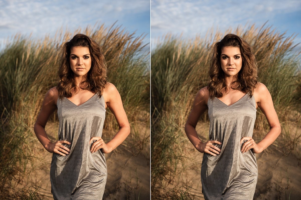
On the left the vibrance slider is all the up to +100 and saturation is on 0. For the right image I did the opposite – saturation is at +100 and vibrance is at 0 …and she looks like she’s just rolled around in a bag of Cheetos!
Saturation panel in HSL
The sliders in the Lightroom HSL panel adjust hue (true color) saturation (color intensity) and luminance (brightness) of a single color at a time.
So even though the saturation slider in the HSL panel adjusts colors on a global level, it’s a more refined saturation tool.
Because the saturation panel allows you to increase and decrease single colors in an image, you can use color theory to, saturate complementary colors in an image, such as orange and teal.
What is posterization?
Posterization occurs during the post production of photos.
Another term for posterization is banding, because when an image is posterized, we can see distinct bands of color in areas that should be smooth, like the sky. You’ll also see spikes (that look like a comb) in the histogram when an image has been posterized.
So go easy on the saturation slider – over saturation is one of the main causes of posterization.
What does vibrance mean?
Vibrance as a photography term is used in photo editing and, like saturation, also refers to the intensity of colors. However, vibrance is adjusted in post processing only.
Unlike saturation, vibrance isn’t something that you can control when capturing an image.
On the left vibrance is -25, saturation 0. Then on the right, vibrance is 0 and saturation is -25. In both photos the colors are less vibrant, but on the left, her skin retains some color.
What does vibrance do in Lightroom?
The vibrance slider in Lightroom is much more subtle than the saturation slider. It’s also quite clever.
While adjusting the saturation slider is a broad change across the whole image, the main difference is that the vibrance slider will first alter the least saturated colors that are under-saturated. So if your image already has well saturated colors, they won’t initially be affected when you increase the vibrance setting.
Only when you increase vibrance to the point where the image is evenly saturated and then increase it further, will the saturation of the entire image increase. It’ll then be oversaturated.
Obviously, when vibrance is pushed too far it also creates unnatural colors.
For portrait photographers in particular the vibrance slider is often a much better choice than the saturation slider, because you can adjust colors without the subject’s skin tones being affected. Unless you take the vibrance slider too far and then of course skin tones will start to look odd.
In the first image I increased the vibrance (+11) to make the muted colors more saturated, then I reduced the saturation (-32), to reduce the overall saturation equally and made all the colors pop.
For the second image I increased the saturation (+11), which affected all pixels equally, and brought down the vibrance (-32) which muted the less saturated pixels.
Tips for using vibrance and saturation in photo editing
- When editing in Lightroom with either slider, it’s best to toggle between before and after versions of your photo, because your eyes adjust to the intensity of the colors on the screen. So, when you view the original image next to the edited image, you’ll see just how far you’ve taken your vibrance or saturation adjustment. On reflection you might realise that you need to dial back the vibrance or saturation level a bit.
- Remember that the natural world isn’t saturated to the max. Saturation varies throughout a scene, depending on light, so keep your color adjustments subtle to prevent color overpowering the image. Unless, of course heavily saturated colors are part of your photography style.
- When adjusting the contrast slider and/or exposure slider, keep an eye on the image colors as both of these editing tools will affect color saturation. You may then need to make further adjustments to both saturation and vibrance.
Summary of vibrance vs saturation
- Just to underline the vibrance vs saturation point in relation to photo editing – the difference is about subtlety in color processing. You could call vibrance a “smart adjustment” – not every pixel gets changed like it does with saturation.
- Vibrance relates purely to editing a photo – it’s not something you can control when you capture an image.
- Saturation of a scene is affected by light when taking a photo, but saturation can also be adjusted when editing photos.
Further reading: Complete guide to Lightroom HSL sliders for adjusting color
Leave a comment
If you have any questions about Adobe Lightroom Classic vibrance vs saturation tools, let us know in the comments.
Also, I love good news, so if my photography tips have helped you to understand vibrance vs saturation in photo editing, share that too.
How can vibrance and saturation assist my ohotis when the ISO is over 10,000
One of the disadvantages of a very high ISO like 10,000, is that images will be less saturated. If at all possible rather use a slower shutter speed or wider aperture so that you can bring the ISO down a bit for more saturated colors.
Regardless of your exposure settings, the vibrance and saturation sliders will still work the same way in post. Just bear in mind that there’s only so far you can push an image before it starts to look a bit weird.