


When editing black and white photos if all you do is desaturate the image to remove all color, you’re missing out on so much that could make your photo more dynamic! Converting to grayscale is a start, but the image will be a bit dull without these black and white editing techniques.
Any digital photo can be converted to black and white, but some work better than others. So the first trick to great black and white images is to start with a photo that has great black and white potential, because of how you captured it. I’ve included a few quick tips at the end.
How can I make a photo black and white?
Just because you took a photo in color, doesn’t mean it has to stay that way – it’s one of the great things about digital photography.

The two ways to make a digital photo black and white are:
- In camera if you’re photographing in JPEG.
- When processing your photos on the computer if you’re shooting in RAW. All photo editing programs can convert digital images from color to black and white.
I use Lightroom Classic to edit photos – that’s the full Lightroom version for computers, although Lightroom (for mobile and desktop) is also great at converting color photos to black and white.
Once you’ve converted and tweaked one photo from a shoot into black and white you can easily copy your edits across as many photos as you want from the same shoot.
Just make sure that the lighting conditions are the same for all your selected photos.
How to get good blacks and whites in photos
You know how if you accidentally put a white sock, or whatever, in the wash with all the blacks the white sock comes out not so white, but you don’t notice how not white it is until you match it up with the other one that didn’t go in the wash?
When the off white sock is next to the black items in the wash it looks quite white. It’s the same in black and white photography.
- To make your whites look really good in a black and white image, you need to have a good black in a photo. In other words, you must make sure you don’t just have varying degrees of gray. This’ll make the photo somewhat “muddy”. A definite black and a definite white, even if it’s a small area, sets the tone. Quite literally. It helps to define all the grays in between and give punch to a black and white photo.
- To bring out the contrast in a photo that doesn’t have actual white, you need black to make light gray seem lighter and therefore white.
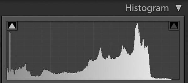
Histogram for the photo below showing black on the left to almost white on the right.
Histogram tip for BW editing
If you’re not sure that you have both good black and good white in a photo, look at the histogram to double check. It’s sometimes difficult to be certain when you’ve been looking at the screen for a while, because our eyes adjust.
The histogram, however, will be able to show you the full tonal range and you’ll see if you’ve gone too far, or not far enough, on either the blacks or whites.
Contrast is essential to black and white photography and ensuring there’s a full range of tones when you take the shot helps to create depth, and therefore interest, in a photo.
General tips for editing photos in black and white
The second part of black and white photography is of course the editing, regardless of which editing program you use. There are no hard and fast rules on how to edit black and white photos, other than to:
- Maximise the tonal contrast
- Avoid blowing out the highlights (unless it’s an intentional choice)
- Don’t block the blacks
Your black and white editing workflow will develop over time, according to your preferences.
Now let’s look at editing black and white photos in Lightroom.
How do you change to black and white in Lightroom?
Below I’ve listed the Lightroom tools to use in your black and white editing workflow for better black and white photos.
The first two are crazy easy and you don’t have to go any further, but to really work your black and whites, the other steps are fantastic for fine-tuning your masterpiece.
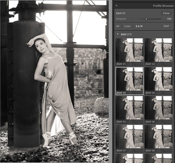
Here you can see I clicked on the B&W 03 profile to change the photo from color to black and white in one click
1. Select B&W Lightroom picture profile
Set your picture profile to one of the black and white options. This is the easiest way to convert color photos to black and white.
You could simply choose Adobe Monochrome to convert a color image to black and white, but there are 17 other black and white Lightroom profiles to choose from. Here’s what you need to do:
- Select browse, then
- Sroll down and
- As you mouse over each sample in the you’ll see your image change in the middle panel
- Click on it to select the one you want
- Define how strong you want it to be by adjusting the slider and then click close
If you want you can leave it at that, but there’s a lot more that you can do with Lightroom editing to refine black and white photos.
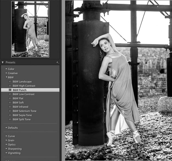
I chose the B&W Punch Lightroom preset to convert this image to black and white
2. Use Lightroom’s black and white presets
In the Develop Module:
- Click on Presets in the left panel
- Scroll down to B&W
- Mouse over the 10 options to view
- Click on the one that you like to select it
There’s even a Selenium Tone preset (blue tinge), a Sepia tone preset (brown tinge) and a Split Tone preset.
To be honest, I actually forget about these first two options most of the time and instead process from scratch, because then I know exactly what’s being adjusted. So let’s get into that now.
These next steps are relevant even if you’ve already selected a picture profile and/or a Lightroom preset.
3. Treatment for black and white
If you don’t use the previous two steps:
- Go straight to Treatment at the top of the Basics panel
- Select Black and White
Or click V on your keyboard to use the Lightroom keyboard shortcut for converting color to black and white.
Just like that, you have a black and white image. Now the fine tuning starts.
4. Tone curve tips for black and white photos
The Lightroom tone curve tool is the best way to work with contrast in a photo. Lightroom even has a built in tone curve preset that you can use, or you can create your own s curve in the tone curve tool.
To access the Lightroom tone curve preset:
- Click on Presets
- Scroll down to Curve
- Then select one of the 4 options. For contrast I’d recommend “Strong S Curve”
The tone curve is the basis of all good Lightroom presets on the market.
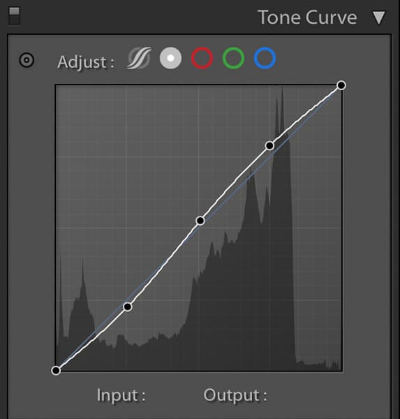
Gentle s curve in the Lightroom tone curve panel.
Or do it manually using the tone curve tool. I won’t go into detail here as I wrote a tutorial on using the tone curve, which you’ll find really useful. Briefly, here’s what you do:
- Select Point Curve
- Place a point at the quarter, halfway and three quarter marks
- Drag the quarter mark point down slightly
- Drag the three quarter point up slightly
Ta-da! One s-curve.
Adjust according to taste and photo requirement.
5. Set white balance for black and white photos
Now that you have a basic black and white conversion, you can fine-tune your image, starting with white balance.
Just because a photo is in black and white doesn’t mean that white balance doesn’t matter. It matters a lot.
When you adjust white balance in a color image you can see the color shift, so it makes sense then that when you adjust the white balance in a black slider the grays will also change.
So, while there’s no hard and fast rule of what the white balance should be in a black and white photo, you do have to adjust it to see the impact it has on the photo when editing in black and white.
This is very much dependent on the photo, so just drag the slider back and forth until you’re happy with the look.
6. Set white and black points
I prefer to set black and white points manually using the sliders. However, you can get Lightroom to automatically set your white and black points in an image.
In the basic panel, just:
- Hold down shift
- Double click the text “whites”
- Do the same for “blacks”
You’ll be amazed at the difference it makes!
7. Adjust contrast and clarity
The contrast and clarity sliders are good for getting some punch into a photo.
- Use the contrast slider to adjust darks and lights
- Use the clarity slider to adjust the midtones
A word of warning – at this point it’s really easy to go overboard. Be careful with how much contrast you push into an image, because it can very quickly look “overcooked”. Your eyes adjust to the image as you work it, soo I highly recommend going to make yourself a cup of coffee at this point.
When you come back to your computer, your eyes will see it differently.
8. BW panel
The BW panel is of course the most obvious Lightroom panel for black and white editing, given that the name is on the label. It’s also where you really get to adjust the impact of color in black and white individually.
You’ll notice that the HSL panel isn’t available once you convert and image to black and white. Well, the BW panel is its replacement – basically HSL for BW photos.
This BW panel color sliders work like filters used to in the film days. For example, drag the red filter down to darken reds, or up to lighten them. Etc etc for each color.
Remember what I said further up about how blacks can make grays seem lighter?
For black and white photos with blue skies and fluffy clouds, or any clouds for that matter, drag the blue slider down and the clouds will almost jump out of the shot. It’s the perfect way to make a cloudy sky really punchy in black and white.
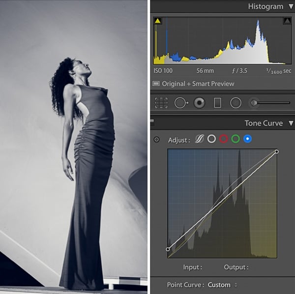
I raised the bottom point to add blue to the shadows and dropped the top point to bring yellow into the highlights. You can see this reflected in the histogram.
Adding color to black and white photos
Yes, black and white photos can have color! Split toning is a black and white photo editing technique that involves adding a color to the highlights and another color to the shadows.
I’m not talking about selective color, where you have a whole image in black and white, except for just one thing in color. So often that looks terrible, it really dates a photo and can look very amateurish if not done very well.
What I’m talking about is adding a blue tinge, for example, to a black and white photo. Or any color/s for that matter. There are two ways to do this:
- Tone curve tool
- Color grading panel
1. RGB Tone curve split toning
Split tone a black and white image in the red, blue or green tone curve channels in Lightroom by:
- Lifting the bottom point up on the graph to introduce color into the shadows
- And/or lowering the top point down to introduce color into the highlights
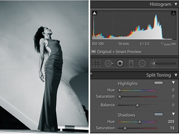
I added blue into the shadows only and increased the saturation to 15. The addition of color to the black and white photo is reflected in the histogram.
2. Split toning with color grading
Split tone a black and white image in the color grading panel using the highlights, midtones and shadows color wheels.
Or add a single color wash to the image with the global color wheel.
In older versions of Lightroom that still had the split toning panel the same thing could be done by adjusting the sliders. You’d adjust the hue and saturation of the highlights and/or shadows, as well as the balance between the two.
Tips for capturing better black and white photos
To get the best black and white photos it helps to start with an image suited to black and white. So, here are general principles you need to know about black and white photography.
1. Composition for black and white photography
When you strip color from a photo your composition becomes more important.
The strongest of these composition elements is leading lines. They pull the viewer into the photo and direct their gaze to the focal point. By removing the distraction of color, leading lines are often more obvious in photos.
So, when editing black and white photos, it helps to define these lines further, which is why taking the photo is only half way to creating a great black and white photo.
Texture becomes more obvious in black and white photos too. So light and light direction has a bigger impact in black and white than in color photos.
Other compositional elements such as shapes, framing and lines are also important.
2. Contrast in black and white photos
Without contrast you have a very dull black and white photo. Contrast is more important to black and white photography than it is to color photography. So, an image that is quite “contrasty” will more than likely be great in black and white.
Factors that increase contrast in an image:
- Direction of light
- Quality of light
- Colors
To make the most of contrast in black and white photography, you need to process your image in Lightroom, or a similar program.

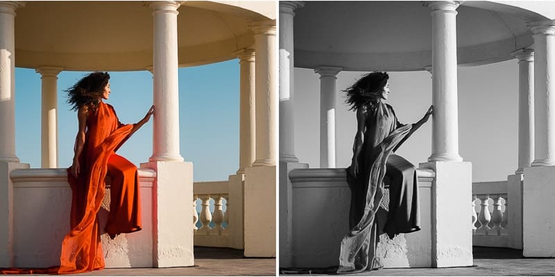
In color this is a striking photograph, but when converted to black and white the yellow and orange is too similar to the pale blue sky in the background. So, even with side lighting for contrast, this photo is not ideal for a striking black and white conversion. Although I could add more punch with further editing in Lightroom.
3. Colors for black and white photos
It’s stating the obvious to say that colors look different in black and white, but do you know exactly what they’ll look like?
We’re used to seeing the world in color, so it’s hard to imagine what green looks like in black and white. For example, which is a darker gray – light green or light yellow?
If you have a red rose against a green background or a yellow rose against a green background, which is going to look better in black and white? (The yellow rose – both red and green are quite dark gray in black and white, but yellow is light gray, even dark yellow).
This is why it can be helpful to set your camera color setting to black and white if you intend an image to be in black and white. This might be called monochrome on your camera, depending on brand.
Before setting your camera to monochrome, first check if you set your image format to RAW or JPEG.
- If you shoot in RAW file format, when you import the photo to your computer it’ll be in color. However, you can then simply convert it to black and white – I’ve listed the steps further down.
- If you shoot in JPEG format, the image will be recorded as black and white, so you won’t be able to change it to color.
What photos look good in black and white?
So, bearing all the above black and white photography tips in mind, before we get into editing black and white photos, here’s a summary of what photos look good in black and white…
- Well composed images with leading lines
- Scenes with defined shapes, lines and framing
- Photos lit from the side to create contrast and texture
- Images with good tonal contrast from light to dark
- Scenes with colors that work well together when converted to black and white
Leave a comment
If you have any questions about editing black and white photos in Lightroom, let us know in the comments.
Also, I love good news, so if my black and white photography tips have helped you to understand how to get the best grayscale images, share that too.
I don’t have Lightroom, but the software I use has a B & W tool that not only changes the picture to B & W but then gives the option to adjust 7 colours which is amazing the variation in the picture you can get. I used to adjust most of the colours to 0% to get a B & W without any colour tinting. After reading your tutorial I have played about with the sliders on each colour and cant decide which version I like most. I then use other tools to add additional punch if required.
Hi Mike
So glad to hear that the tutorial has encouraged you to try out a few different editing techniques on black and white photos! The best and worst thing about improving your editing skills is that suddenly you have so many more options. ? But I’d rather have options than not know how to edit.
The Hi Jane I am colour blind, only red and green, but this affects orange, pink, purple, and anything with red or green in it. Many thanks for your article. Been taking photos for over 70 years, and colour has always been a problem, but your email has been a great help. Graham
Hi Graham
Thanks for your comment – great to know the article has helped you. 70 years – that’s amazing. You’ve certainly seen some changes in the photography industry!